Chainlink has outperformed the rest of the sector with a sharp rally during the past week. Here’s what’s driving this, according to on-chain data.
Chainlink Price Has Been Sharply Moving Up Recently
The past few weeks have been an excellent time for LINK investors, as the asset has almost tripled in value as compared to the start of November. At the start of this week, the coin saw a bit of a setback, but the sharp bullish momentum has already resumed in the last couple of days.
Related Reading: Cumulative Bitcoin Volume Hits $131 Trillion—But How Much Of It Is ‘Real’ Transfers?
Below is a chart that shows what LINK’s performance has been like over the last few months:
The price of the coin seems to have rapidly been moving up recently | Source: LINKUSDT on TradingView
From the graph, it’s visible that after a jump of over 47% from the bottom earlier in the week, Chainlink has managed to break above the $28 mark. The asset now sits at weekly profits of more than 22%, making it the best performer among the top cryptocurrencies by market cap.
Speaking of market cap, LINK is now the 12th largest in the sector in terms of this metric, sitting just above Shiba Inu (SHIB).
Looks like the market cap of the coin is $17.7 billion at the moment | Source: CoinMarketCap
As is visible in the above table, the next asset to beat for Chainlink is Avalanche (AVAX). Its market cap is still $3.5 billion more than LINK’s, so it would be a while before a flip happens, assuming the bullish momentum doesn’t die out.
As for what has been fueling the cryptocurrency’s surge, perhaps on-chain data can provide some hints.
LINK Sharks & Whales Have Been Busy With Their Accumulation
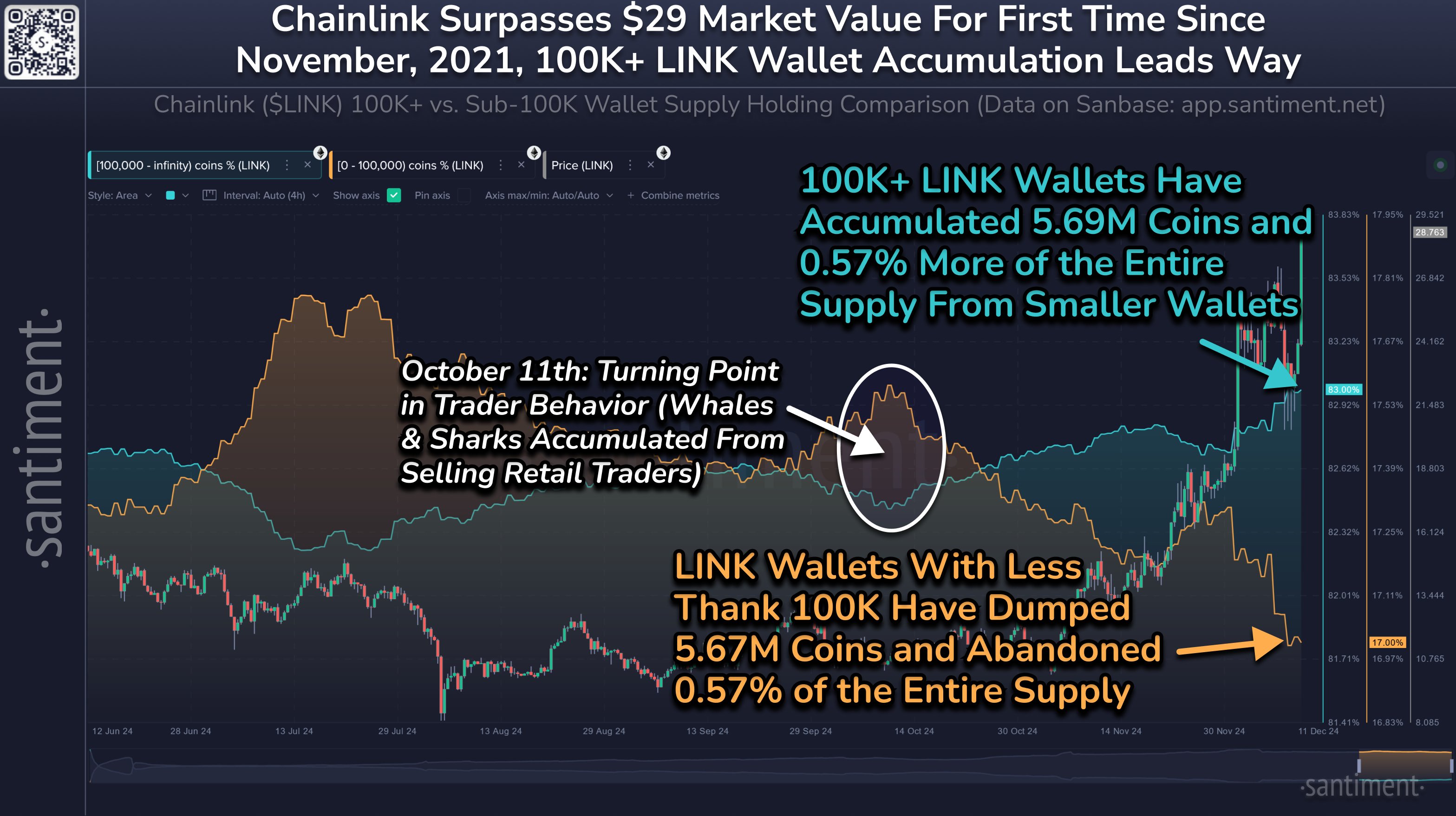
In a new post on X, the on-chain analytics firm Santiment has discussed how the behavior has differed between the small and large entities on the LINK network recently. The indicator of relevance here is the “Supply Distribution,” which keeps track of the total amount of Chainlink that the members of a given wallet group are holding right now.
In the context of the current topic, the two address ranges of interest are 0 to 100,000 coins and 100,000+ coins. At the current exchange rate, the 100,000 boundary between the two groups converts to about $2.8 million.
Addresses who hold greater than this value are considered the key investors of the market, known as the sharks and whales. Thus, the Supply Distribution for the group tracks the behavior of the large investors.
Now, here is the chart shared by the analytics firm that shows how this indicator compares between the sharks and whales and the regular investors:
The metric appears to have gone opposite ways for the two cohorts | Source: Santiment on X
As displayed in the above graph, the small Chainlink investors have been selling during the last couple of months, potentially because they didn’t think LINK would turn itself around.
Related Reading: Bitcoin Hashrate Inches Back To All-Time High As BTC Reclaims $100,000
The sharks and whales, however, smelled the opportunity and bought a total of 5.69 million coins from this group. As Santiment explains,
Throughout the history of crypto, large wallets scooping up coins from impatient or panicked retail traders is typically a recipe for market cap rises.
Featured image from Dall-E, Santiment.net, chart from TradingView.com


